Weather data visualization for San Francisco Bay Area – a Python Pandas and Matplotlib Tutorial
Weather data is a great type of input when starting to learn tools and technologies for your data science skills. This project will introduce us to the basics of Pandas and Matplotlib Python libraries using data for San Francisco, San Mateo, Santa Clara, Mountain View and San Jose in California.
Why Pandas?
Pandas is an open source Python library which will help with data cleaning, manipulation, transformation, and visualizations. This project will introduce basic concepts like
- data cleaning
- data frames
- data manipulation
- data transformation
- data visualisation
Weather data analysis – the code
Let’s start with defining all of the classes and functions we need and loading the weather data. You can download the weather.csv file here.
import numpy as np
import pandas as pd
import matplotlib as mpl
import matplotlib.pyplot as plt
import seaborn as sns

# Import San Francisco Bay Area Weather data from CSV file
data = pd.read_csv('weather.csv')
Then we make the variables names a little friendlier for users:
# Make variables some friendlier names for users
old_names = ['Max TemperatureF', 'Min TemperatureF', 'Mean TemperatureF', 'Max Dew PointF', 'MeanDew PointF',
             'Min DewpointF', 'Max Humidity',
             ' Mean Humidity', ' Min Humidity', ' Max Sea Level PressureIn', ' Mean Sea Level PressureIn',
             ' Min Sea Level PressureIn', ' Max VisibilityMiles', ' Mean VisibilityMiles',
             ' Min VisibilityMiles', ' Max Wind SpeedMPH', ' Mean Wind SpeedMPH', ' Max Gust SpeedMPH', 'PrecipitationIn',
             ' CloudCover', ' WindDirDegrees', ' Events']
new_names = ['maxTemp', 'minTemp', 'meanTemp', 'maxDew', 'meanDew', 'minDew', 'maxHum', 'meanHum', 'minHum', 'maxPress',
             'minPress', 'meanPress', 'maxVis', 'meanVis',
             'minVis', 'maxWind', 'meanWind', 'maxGust', 'preIn', 'cloud', 'WindDir', 'events']
data.rename(columns=dict(zip(old_names, new_names)), inplace=True)
After that we can delete the unused column in CSV file and remove the unreal samples (i.e. -100 degrees Celsius) – this makes our chart more accurate. In our example, we remove unrealistic temperature values. For this we will use the following code:
# Delete unused column in CSV File

del data['preIn']

# Remove the bad samples in temperature
data = data[(data['maxTemp'] <= 110) & (data['minTemp'] >= 25)]
Now we are going to extract a list of unique ZIP code values from CSV file. This will allow us to determine how many different cities we have in our data.
# List unique values on example column using drop_duplicates(We can also use unique())
df2 = pd.DataFrame(data, columns=['ZIP'])
u = df2.drop_duplicates(['ZIP'])
The results are the following ZIP codes, which we will use in the next steps.
# Get data for cities
# 94107 -> San Francisco
# 94063 -> San Mateo
# 94301 -> Santa Clara
# 94041 -> Mountain View
# 95113 -> San Jose
zipcodes = [94107, 94063, 94301, 94041, 95113]
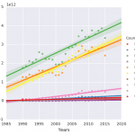
After that, we can create plots of the data, such for example for mean temperature in San Francisco Area using following code:
# Plots of Mean temperature in Fahrenheit scale

plt.figure()
for zcode in zipcodes:
  local = data.loc[data['ZIP'] == zcode]
  df1 = pd.DataFrame(local, columns=['meanTemp'])
  plt.plot(df1.as_matrix(), '-', label=str(zcode))

plt.xticks(x,labels,rotation='vertical',fontsize=12)
plt.grid(True)
plt.xlabel('Month')
plt.ylabel('Temperature in Fahrenheit scale', fontsize=15)
plt.title('Fahrenheit Mean Temperature on Bay Area Cities',fontsize=20)
plt.legend(["San Francisco", "San Mateo","Santa Clara", "Mountain View","San Jose"])
plt.show()

…and that’s it 🙂
Want to launch the project? Download code from GitHub .
If you have any questions about the project, the libraries or this post, please ask the questions in the comments.
Resources
- Official Pandas Documentation (You can also download it in PDF version)
- Femi Anthony “Mastering Pandas”
- Michael Heydt “Learning Pandas”